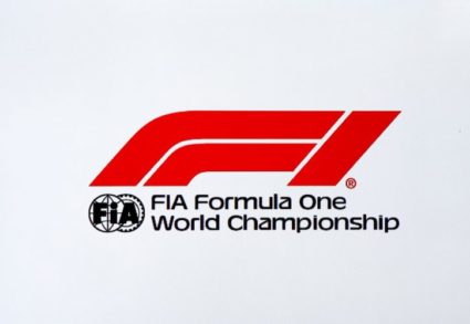
After 23 years, F1 is getting a new logo and a lot of people aren’t too happy about it. The new Formula 1 chiefs explained the new logo claiming the old design was not useful for modern digital platforms nor merchandise, and that F1 needed a much simpler logo.
The new design, as explained, “is based on two cars going around a circuit and battling for the finish line”.
“It takes inspiration from the low profile shape of the car, two cars crossing a finish line,” she said. “It is incredibly bold and simple – so as we apply this in today’s market and being mobile and digital led, we have much more flexibility and versatility with this logo.”
I don’t think it’s that bad, and to be honest, what worries me as an F1 fan is the sport’s future rather than a new logo, and hearing that Ferrari may consider leaving F1 by 2020 due to the increased standardisation in the proposed 2021 engine rules is way more worrisome than agreeing on a logo to sell more hats.
