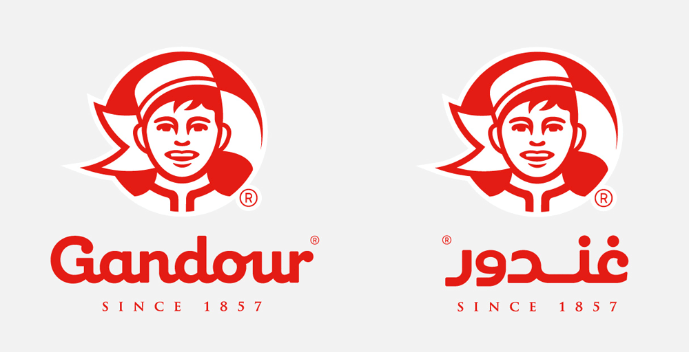
Gandour is changing its old logo and switching to the new one above. The bell-boy was also present in the 1940s’ logo along with the flag but he is becoming the primary focus now.
I’ve never really paid that much attention to Gandour’s logos but I like the new one.
PS: The new logo was designed Mash Creative and SocioDesign.
The key objective was to create a new iconic brand marque for Gandour, capturing the essence of the company in a simple, yet modern way. The new brand marque needed to present Gandour as a contemporary company but without alienating existing customers and stake holders. Our focus was to ensure that the new logo referenced key symbology from previous iterations as a means of continuing tradition. We chose to highlight the bellboy and flag elements, thereby creating a marque that hinted to the past but also provided a platform for the company going forward. The new Gandour logo will be rolled out across their entire range throughout 2015.