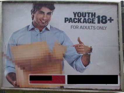
One of the banks in Lebanon just launched a campaign aimed at young adults. They make it sound so X-rated! Their radio commercials start off by warning people that this ad is for mature audiences only. Their ads state 18+, for adults only. Come on people, it’s just a bank account, no need to make it sound raunchy!
What I liked the most about this campaign are the billboards. The guy is holding a box that’s pixelated as if he’s carrying something R-rated in it. It reminded me of the Saturday Night Live skit with Justin Timberlake “Dick in a box”. You can watch it here to know what I’m talking about [YouTube]


That’s actually a real song off of Lonely Islands album Incredibad. They have a bunch of funny/raunchy songs, just released one with Akon called “I Just had Sex”.
Not really sure what I think of the ads, Lebanon is already over-saturated with sex driven ads (and general things).
I thought those were boobs at first.
LOL Chahe that is exactly the first thing that came to mind when I saw that ad!
I can’t believe I didn’t think of “Dick in a box” D:
I mean it’s right there staring you in the face! Maybe if the box was a bit lower.
hahahahahahhahahahahah I love it!!! It’s the first time I c this video n it’s funny as hell n totally related to this billbord! dude ur posts r always funny as hell!!! love them
Wow! I haven’t seen the “Dick in the Box” video before either, but it just cracked me up. It’s so ridiculous.
But I totally agree with you; they are stretching it a bit too far…adults only??? But hey, maybe a “dick in the box” is one of those “special offers” that comes with the account…who knows?
i thought these were boobs as well :p hahah love ur blog!
Thanks Paty! I got hungry just by checking your blog!
well, first time i saw it, it was a bit fishy
i wondered what it could be about!
could it a support for porn? sex toys? prostitution? possibilities are endless especially with a wild imagination like mine
fransabank has already released kids and adults card posters that looked like 007 and harry potter, but i think they didnt get much attention 😛
How low and absolutely pathetic. What an embarrassment.
LOOOOL! Good one! I saw it and was wondering why the box was pixelated. Looks like the designer had a low-res photo of the box that got printed by accident.. big design NO-NO! Their campaign is all wrong.. Like you said, it’s just a bank account ad! Invest those ad dollars on stronger campaign 😛
well if it attracted ur attention to talk about it then it worked…
i know the dick in a box vid its funny and well its mainly from another saying
“hes got a big package” ever heard that before 😛
u cant say its not a good idea, what ideas did the other banks come up with that got stuck in ur head… yup
plus u cant say that i dont look good in that pic 😛 haha