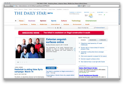
Around 10 days back I posted about the new updated website for The Daily Star. My biggest issue with it was the fact it lacked any personality. So I decided to spend 15 minutes quickly putting together what I think would be a better version of their website. So the picture above is what’s currently there now and below is my remix.
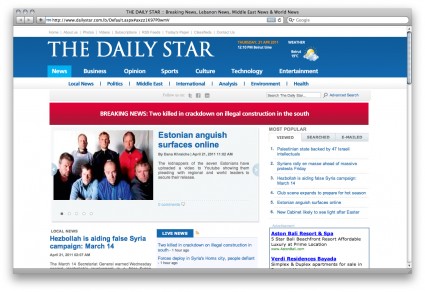
Not a major change but enough to give it some sort of character. If I spent more time on this I would fix up the grid and spacing all over the page as well as get the font sizes in order since they currently use around 10 different sizes. So what do you guys think?
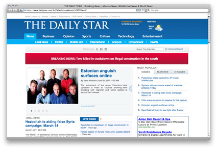
Update: I just realized how they could still keep a different color for every section, check the images below


I think it’s an improvement already.
The way they currently use different colors for each subsection is pretty funny 😀
Your blue header does give the whole page a stronger character and better highlights the name of The Daily Star.
i think if you enlarge the size of the NP title, and back it up with an attractive color to make it stand out just like you did, it’s more than enough, the rest is pretty acceptable…
check out the updated images i added to the post. it would actually be very easy for them to keep the different colored sections and still keep it tasteful. If I’m free this weekend (i doubt) will do a proper full revamp of their main page.
you’ve got too much free time on your hands
that is exactly what i wanted them to change, i actually took the survey and said that they should have a blue background, so i guess there’s a huge improvement because they are actually responding to readers 🙂
Oh you changed it o.0 I must read more carefully next time gosh, but i really love the changes you did.
😀
Mark’s ultimate goal in life :” giving the world … Peace…..and better websites”…