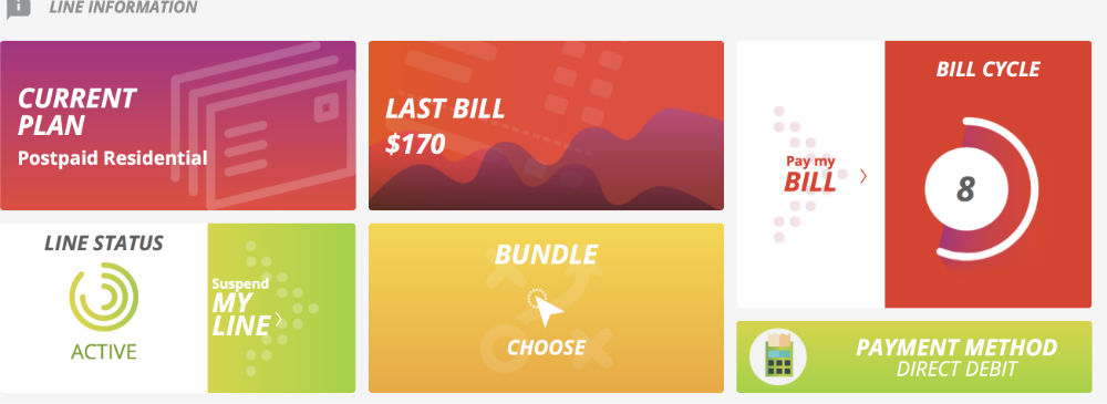
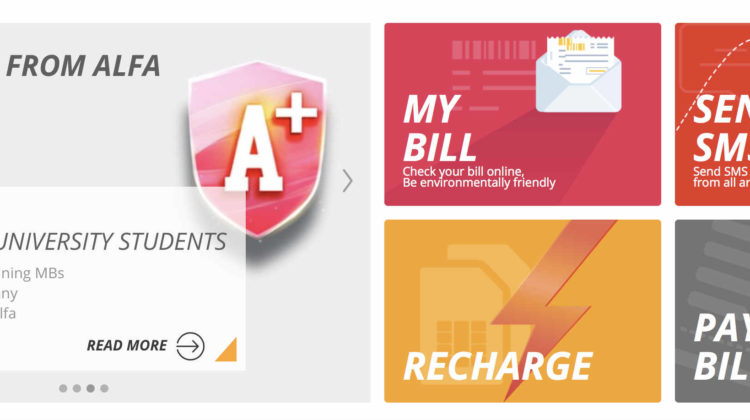
Alfa Telecom has finally given their website a much needed facelift. The new website makes it much easier and faster to settle your bill, check your account with a lot less clicking and page reloads. More importantly, the menu items are now much bigger and clearer unlike the tiny drop down lists we had before.
When you first enter the website, you can directly access your account, send an SMS, recharge your phone or pay your bill. Once you log in to check out your account, you get all the necessary information nicely displayed on one page.

One thing I would change is the huge banner on the landing page. It’s taking up way too much space in my opinion. Otherwise, the new website looks nicer, is more organized and easier to navigate now.


[vivafbcomment]