

There’s been a lot of talks in the past few days about Google’s Coronavirus mobility reports, which are feeding users’ location history to “chart movement trends over time by geography, across different high-level categories of places such as retail and recreation, groceries and pharmacies, parks, transit stations, workplaces, and residential”.
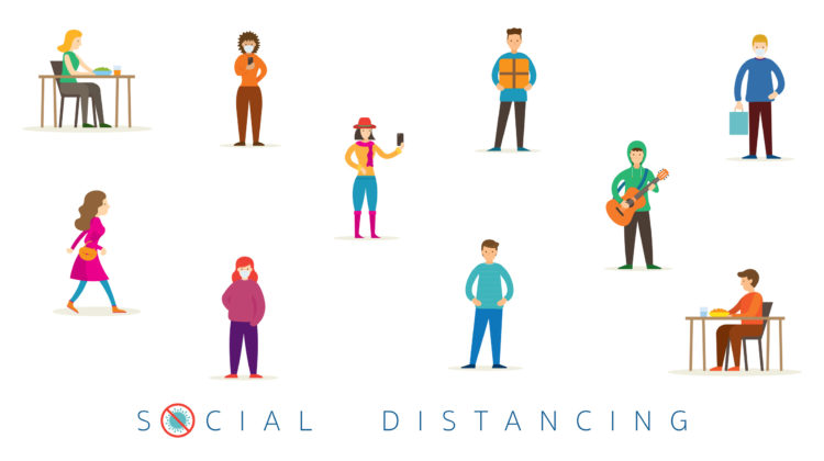
In simpler terms, Google is feeding from its users’ movements to show how visits and length of stay at different places change compared to a baseline, mainly to try and indicate if social distancing measures are working or not. Needless to say, the stats are not highly accurate due to several factors but they can give authorities a hint nonetheless.
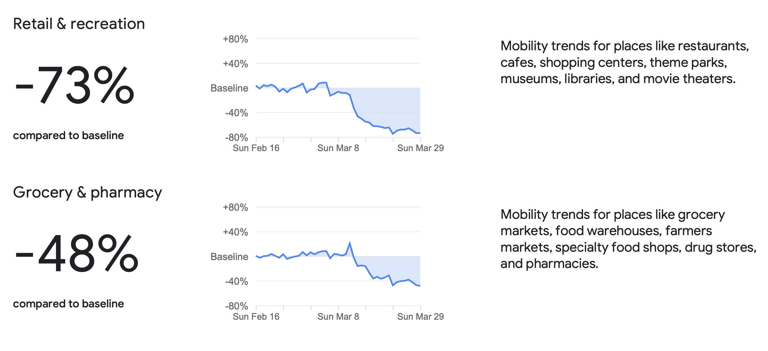
Looking at the Lebanon report, the numbers, if accurate, are encouraging as they indicated a 73% drop in mobility trends for places like restaurants, cafes and malls, a 48% drop in mobility trends for supermarkets and grocery stores, a 41% drop in mobility trends for work places, an 84% drop in mobility trends for transit stations (buses I guess) and a 59% drop in visits to parks (Sanayeh probably since there’s no other😁).
It would have been better if we had stats per region, because we’ve seen alarming videos in the last couple of weeks of crowds not respecting social distancing measures in areas like Tripoli, Akkar, Baalbeck and others. I suppose we have to wait and see now, as it’s not clear yet if we’re flattening the curve, especially with the severe lack of testing. Fingers crossed 🤞.


[vivafbcomment]