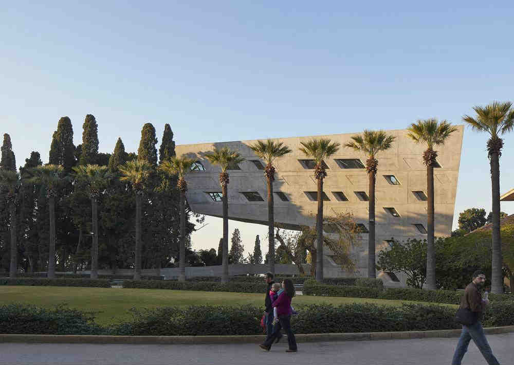
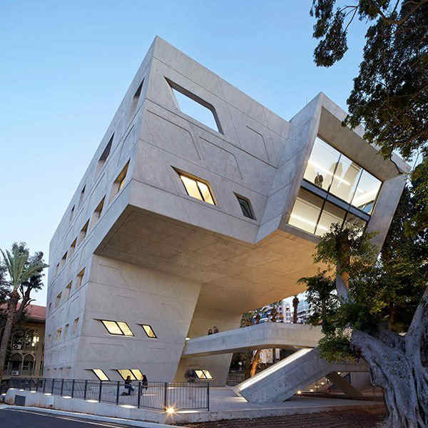
The Issam Fares Institute For Public Policy and International Affairs was listed among the 9 best new university buildings around the world. The building was created by Zaha Hadid Architects and serves as an international think-tank for Middle Eastern affairs.
I’ve tried hard to look at the building from different perspectives but I still find it ugly. I’ve posted more pictures below and you can check out other university buildings [Here].
Speaking of AUB, the Charles Hostler Student Center was also listed among the 50 most impressive environmentally friendly university buildings. You can read the original post [Here].
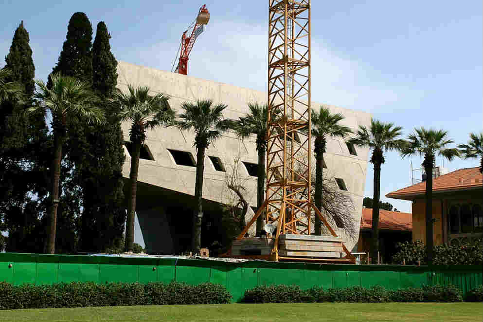
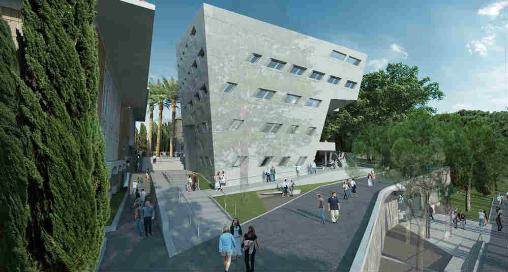
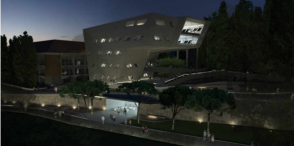
Thanks Fouad!


True that. Ugliest building on campus.
I find it beautiful. This is a piece of art, seriously. That what explains why some find it beautiful and others not. Also, you should not stop only on the design, but on the challenge to create such a structure, with the big extension without a pole supporting it …
Maybe you don’t know much about architecture then. A) it doesn’t take into context the surroundings. B) creates a massive blockade and destroys and light coming to the path behind it. Also literally overstepping and covering the building right behind it. C) in a campus with nice masonry she decided to go with ‘grey’ ugly concrete. And No not because it’s both hated and loved makes it an art work. A true work of art is loved by all people and a true designer would know that this is rarely the case. A true work of art will make You stand in front of it and wonder, it would make critics afraid to place negative comments about it because it’s hard to find any, it leaves you in awe which this building hardly does. My first reaction was ‘eukh’. That’s just my opinion, and your definetly entitled to yours. Just wanted to share that to let you know.
Reminds me of the Stata Center at MIT. The building was designed by Frank Gehry, but it was riddled with engineering deficiencies.
While the building may be aesthetically appealing, it does not fit in its context.
This is a major drawback to any physical design. Its alien presence denatures the essence of the green oval’s character and I believe it would have been better if it was located in the lower campus.
this short animation gives the impression of what this building really feels like
https://www.facebook.com/video.php?v=10154235356290026&set=vb.687190025&type=2&theater
Thanks CF! Totally agree 100%…it’s a monstrosity. People who claim to like it, I believe, are just influenced by the “brand name” of Zaha. If anyone less known had created this thing, I highly doubt anyone would have liked it. It’s visual pollution!