

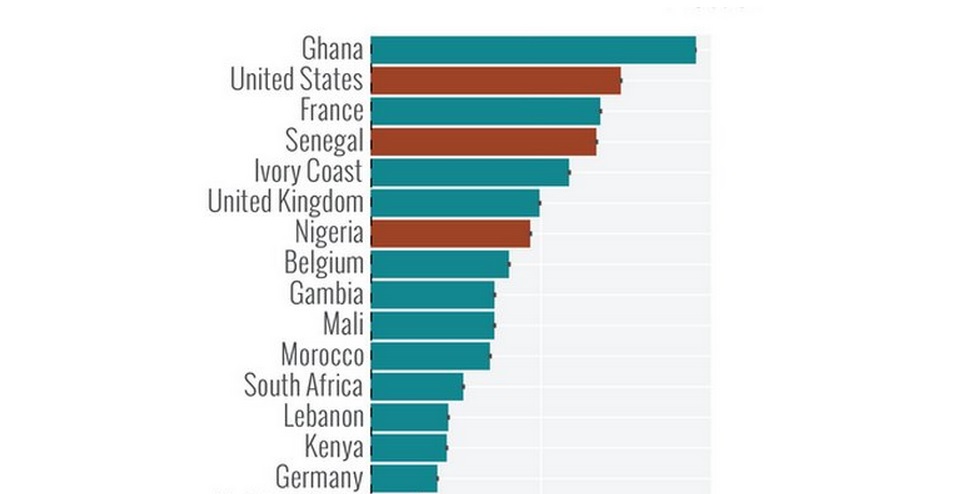
The Modeling of Biological and Socio-Technical Systems at Northeastern University in Boston published a list showing the countries in which Ebola is most likely to show up. The scientists used Ebola disease spread patterns and airline traffic data to come up with this table but keep in mind that this is the risk of a single imported case, not the risk of an outbreak.
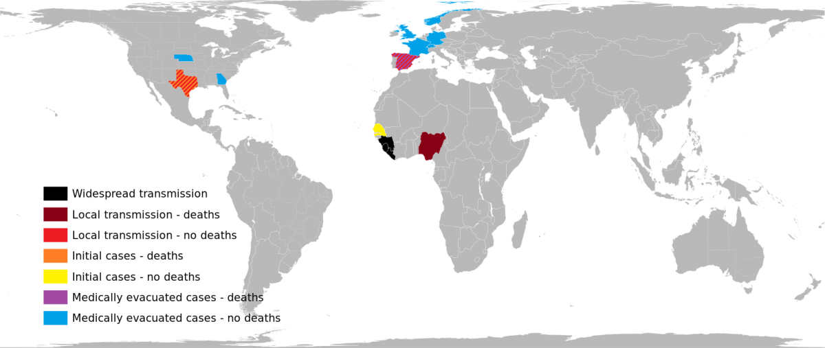
Even though Lebanon is on that list, the risk is less than 25% but it wouldn’t hurt to take all the necessary precautions. On another note, I hope this map will help some Lebanese understand that a tiny part of Africa is affected by Ebola because our ignorance of Africa is proving to be more dangerous than Ebola.
Check out more info [here] and [here].


Najib hi!just stumbled across ur blog!Long time ! The problem with what you are saying is that we have more people coming from Africa than any other affected nation and this is why we are more scared from African domestic workers for example…I don’t think it has to do with ignorance
Ignorance: case in point: See previous comment.
If well managed, it shouldn’t be a problem for Lebanon with one main point of entry which is the airport. Screening and precautions should also include cargo, animals and food coming from the African continent.